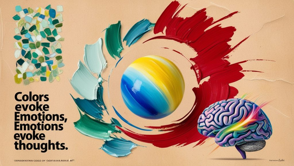
Color is one of the most powerful elements in art, with the ability to evoke emotions, influence perception, and communicate complex ideas. Artists have long understood the psychological impact of colors, using them to create mood, convey meaning, and draw the viewer’s eye. The psychology of colors is a fascinating field that explores how different hues can affect human behavior and emotions.
Warm vs. Cool Colors
Colors are often categorized into warm and cool tones, each evoking distinct psychological responses. Warm colors, such as red, orange, and yellow, are typically associated with energy, warmth, and passion. These colors can create a sense of urgency or excitement in a painting. For example, red is often linked to strong emotions like love, anger, or danger. It can increase heart rates and draw attention, making it a popular choice for creating bold, impactful artwork.
In contrast, cool colors, such as blue, green, and purple, tend to have a calming and soothing effect. Blue, for example, is often associated with tranquility, peace, and stability. Artists use cool tones to evoke feelings of calm or to represent nature, as green and blue are frequently connected to landscapes, water, and vegetation.
The Emotional Impact of Colors
Beyond the warm and cool spectrum, individual colors can carry specific psychological meanings. Yellow, for instance, is often seen as a cheerful color, representing happiness and optimism. However, in some contexts, it can also signify caution or anxiety. Similarly, purple is often linked to royalty, luxury, and spirituality, but in darker shades, it can evoke feelings of mystery or melancholy.
Black and white, while not typically seen as “colors” in the traditional sense, play a significant role in art. Black is often associated with power, sophistication, or mourning, while white symbolizes purity, simplicity, and peace. Artists frequently use these contrasting shades to emphasize themes of duality, balance, and contrast.
Cultural Influences on Color Perception
The meaning and emotional impact of colors can also vary depending on cultural contexts. In Western cultures, white is typically associated with weddings and purity, while in some Eastern cultures, it is the color of mourning. Artists often consider these cultural influences when choosing their color palette to convey specific messages to diverse audiences.
In art, the psychological effects of color allow artists to manipulate how their work is experienced and understood, making color a crucial tool in both the creation and interpretation of art.